Elise Edman is a senior Computer Science major, Data Science minor, and has just finished her last volleyball season at Davidson. Next year, she will be working in St. Louis, MO as a Systems Engineer for the Cardinals.
Dan Murphy is a junior Economics major, Data Science minor, and Data CATs consultant in the Hurt Hub. This summer, he will be working in Denver, Colorado designing, developing, and testing algorithms for darknet data at DarkOwl Cybersecurity.
In October of 2019, the students of Dr. Maxime Lamoureux-St-Hilaire’s course, Imaging the Earth (ANT 377), collectively mapped Davidson College’s campus. Using the “Collector for ArcGIS” app (available for download in Apple’s App Store), students walked around campus to collect the coordinates and other attributes of features like trash, garbage bins, trees, benches, art, honored objects (objects left alone and not stolen), and events. With this collaborative dataset, students were then tasked with using ArcGIS Pro software to create maps of Davidson’s campus with these features. This project ultimately changed the way that some students view the campus’ features and layout.
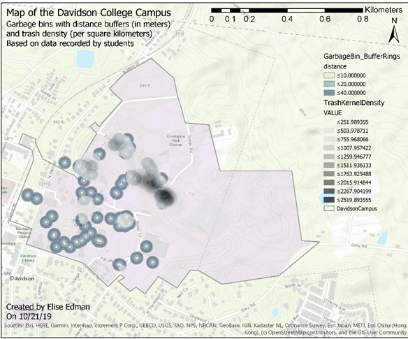
One map that students created displays garbage bins with rings located 10, 20, and 40 meters away from the garbage bins’ coordinates (Map 1). The rings function to demonstrate the garbage bins’ proximity to each other and to trash found throughout campus. The map also features a representation of trash density on campus, where the darkest color is the area where trash is the densest. Most of the garbage bins and trash are found in the most student-frequented areas of campus, which is logical. It is interesting that the area with the densest trash is an area with plenty of garbage bins available to use. It appears that the distribution of garbage bins throughout campus is designed appropriately, but that students are not using them responsibly.

Map 1. Displays the distribution of garbage bins (with multiple ring buffers) and trash (with kernel density) throughout Davidson College’s campus.
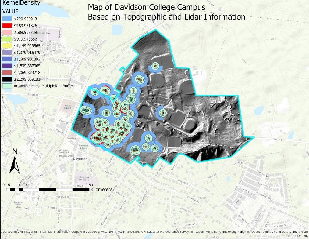
Another map that students created displays the benches around Davidson’s campus with rings located 15, 30, and 45 meters away from the benches’ coordinates (Map 2). In this context, the rings demonstrate the proximity of benches to other benches and artwork around campus. Students also used kernel density to analyze the density of benches and artwork throughout campus. As seen in Map 2’s legend, the red coloring represents the densest area of benches and artwork. The blue shading represents less densely-populated areas. The densest areas for benches and artwork on campus are near Chambers, Union, and the library. This is logical, as prospective students spend most of their time touring campus around these three spots. To make the campus visually attractive to visitors, it is logical that artwork and benches would be clustered in areas where they will be seen the most. Furthermore, there are additional dense areas behind the football field and near Baker Sports Complex. It appears that Davidson would do this to draw visitors to well-known on-campus locations.

Overall, this project was a valuable experience for many students in Dr. Lamoureux-St-Hilaire’s “Imaging the Earth” course. It challenged our previous perceptions of Davidson’s campus, forcing us to be more analytical about our surroundings and to think deeper about the decisions that Davidson administrators and students make. Additionally, this project helped students gain a better understanding of ArcGIS Pro geoprocessing tools (like multiple ring buffer and kernel density tools), formatting maps, and creating map PDFs that are ready to be shared with others. Through this valuable learning experience, students gained important skills necessary for performing accurate, comprehensible, geographical research and presenting it to others.

Speak Your Mind